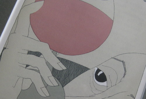
THE FELLOW ASSIDUOUSLY OGLING his glass of red wine is a detail from a lithograph that hangs in my office, one of a trio I bought from a shaggy bouquiniste (quayside seller of vintage books, pamphlets, and prints) in Paris long ago. There were around a dozen in a series depicting the pleasures of wine, but I only had francs enough (this was pre-Euro) to buy three, so I chose the ones that tickled me most.
The other two are delightful enough but the one you see is my favorite in part because it reminds me that some of the most gratifyiing rewards wine has to offer come from looking.
Although almost everyone queued at the tasting table at Central Bottle from week to week understands the swirl, sniff, taste routine – it’s rather less usual to see someone begin her approach by raising the glass to a position where its color and clarity can be enjoyed and considered – a gesture that really ought to be step one.
I have the sense that the visual aspects of wine were more warmly appreciated in days gone by. The wily diplomat Tallyrand – a man who served Louis XVI, the Revolutionaries, and Napoleon in turn and was, despite being a bishop, in thrall to the pleasures of the table – is widely credited with the observation that the proper way to approach wine is first to look at it, then to smell it, and finally to talk about it. Exactly where the tasting part was supposed to come in isn’t mentioned, but the implication seems clear: the wily old bon vivant considered the looking and the sniffing to be the main event.
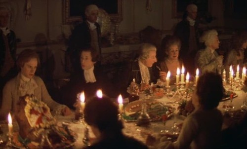
I suspect that one factor that can’t be discounted is the powerful combination of wine and candlelight. In a world lit only by fire, one in which visual stimulation of any kind was hard to come by and color an expensive commodity in its own right, the play of flame on wine amplified by cut crystal stemware would have been a memorably enchanting experience.
You get a feel for this in the scene from the Stanley Kubrick film Barry Lyndon (shot entirely in available light), below.
Traditionally, notions of a wine’s varietal make-up, provenance, or age could be inferred from the hue of wine. It’s still done, but making such judgments has gotten dicier in the last 20 years or so as winemakers, ever more finely-tuned to the mood of their markets, have focused on giving their red wines a deeper, more opaque appearance (suggesting richness, extraction, and concentration) and their whites a paler, more transparent look.
Part of this is attributable to the hard-to-dispute detail that red wines are in fact much more concentrated and extracted than they once were (in part because we’re more successful and getting grapes ripe), and that white wine made in a way that emphasizes primary fruit flavors and aromas are generally denied any opportunity to interact with pigment-rich grapeskins or oxygen, thus ensuring a bright, limpid, but wan appearance.
I don’t know how many red wines in my tasting database are described by some variation of “nearly opaque ruby-black,” but it’s a lot. My sense is that many wine drinkers – even quite experienced ones — are now suspicious of any hint of paleness in red wine, as if somehow they aren’t quite getting their money’s worth if the wine isn’t deepest-dyed. The more expensive red wine becomes, the deeper and darker it ought to be, seems to be the thinking.
But the tendency for red wine to become ever more opaque and white wine more water-like isn’t the most concerning aspect of this. Dark wines can be beautiful and pale wines lovely. Rather it’s the tendency for all wine to look alike that I find disturbing. A tedious uniformity seems to have crowded out that riot of color that once characterized wine, diminishing the intensity of one of the delights of wine drinking: le plaisir des yeux. The pleasure of looking.
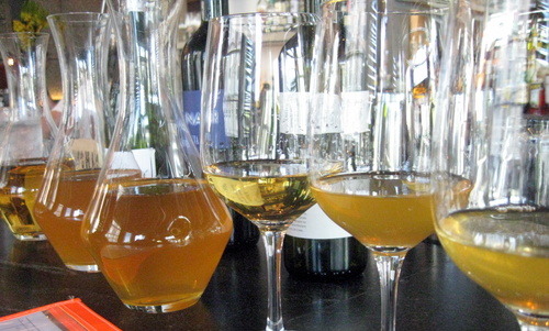
That’s why I’m so pleased that wine’s historic kaleidoscope of color appears to be alive and well among vintners dedicated to a more naturalist — and in some cases folkloric — approach, the kind who are not inclined to coerce their wines into a bland uniformity of any kind, least of all of hue. I took the photo above a couple of years ago at Island Creek Oyster Bar in Boston’s Kenmore Square while tasting some of GM Tom Schlesinger-Guidelli’s “rusty whites.”
The wines were certainly interesting to taste, but I have to say it was their stunning appearance that captivated, with colors that ran from pale amber to topaz to Darjeeling tea and showed varying degrees of clarity.
Wine is a multimedia experience. And I want all of it.